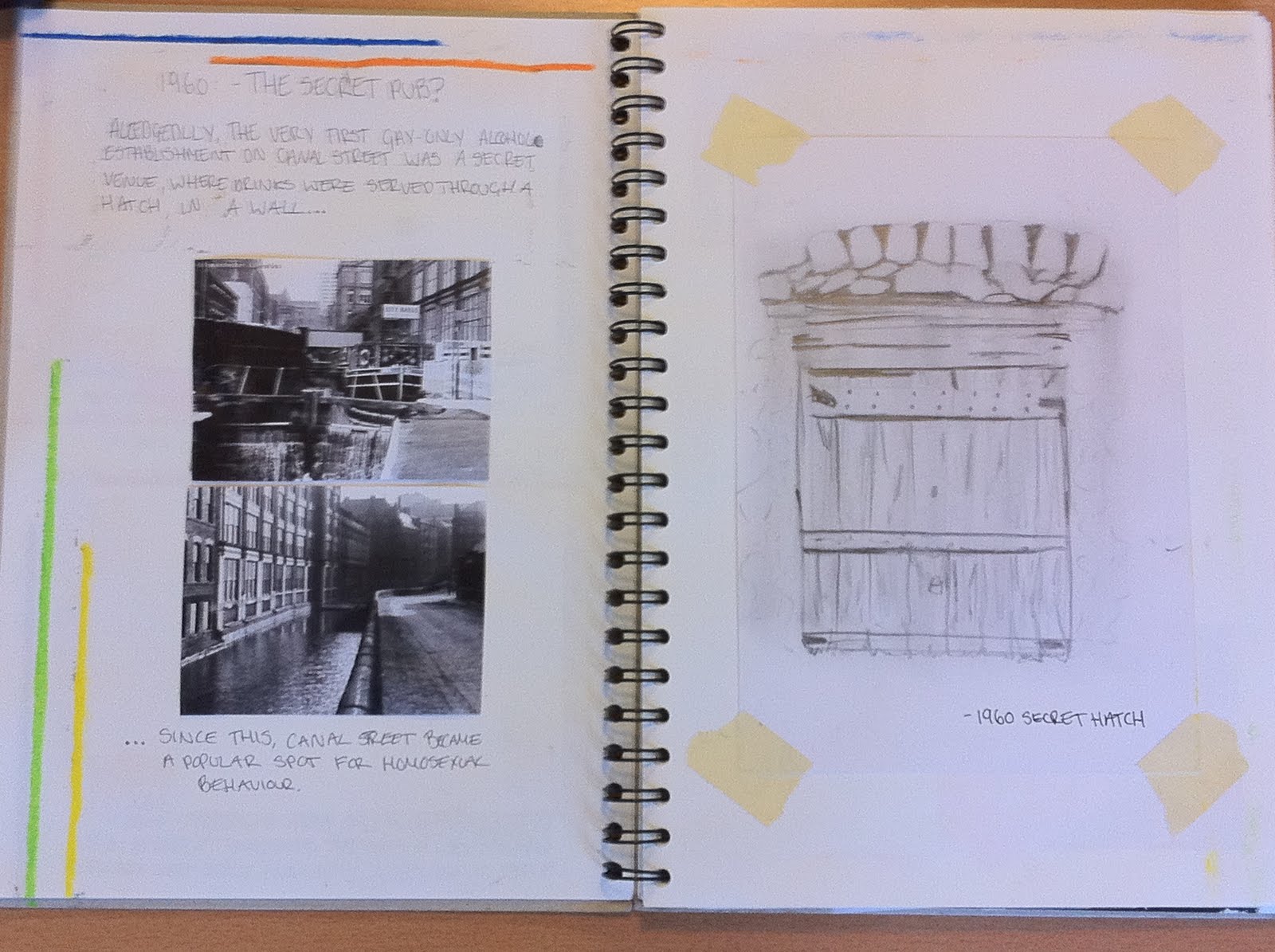
Saturday 19 November 2011

Origins Unit 1:
SLEUTHS, SPIES AND LIES:
Digital Image Making:
Workshop series 2:
After my 3D Construction workshop, I was looking forward to beginning Digital Image Making. Our first task was to do 12 drawings ready for scanning on to photoshop, so I produced some quite simple drawings to start off with, however was looking forward to using my original drawings and photographs digitally.
In the first two Digital Image Making workshops we were taught how to do the basics of photoshop, such as creating brushes, colour swatches and modifying photographs.

This was the design I came up with throughout the two sessions:
It shows a variation of techniques, I just experimented with everything including brushes, painting, filling, photograph modification and I played around with composition of motifs. I was quite happy with it as my first piece, even with all of the techniques in one design.

It was then up to us to use our time on photoshop and employ the techniques to create designs relating to our project. I wanted to create some repeat patterns, because I have a little experience of doing so in my Art and Design Foundation Diploma last year at Newcastle College, where I also enjoyed experimenting with bright colours.
After a few attempts, I used chair leg motifs to create this repeat pattern. I thought it would have been too much to fill in all of the background orange, however it has ended up looking quite 70’s!
The use of block colours and motifs reminds me of Moschino’s S/S 2011 work:
The retro style, block colours and bold motifs in this design by Moschino has always stood out for me when creating patterns in photoshop, as I like the bold style and use of repeat, as well and the daring use of clashing colours and patterns which work so well with the style of their Cheap N Chic label.

Following my work with repeat patterns, I decided to look more at composition, using motifs and colours carefully:
I used my colour swatch derived from a photograph of Canal Street, I like how the faded yellow compliments the different shades of blue in the picture. I think it was one of my more successful designs which focus on composition mainly because of the colours and use of motifs, especially as one of my first attempts.

Although this effort may not be particularly effective, due to really simple layout, I thought I would show it because of the vase-like motif I created from an original drawing of rectangular stacked chairs. I used the (transform > distort) effect on photoshop to create the new motifs.

I then went on to experiment with photographs I took for my initial research.
I selected a portion of the photograph using the magic wand tool, and used different shades of blue and grey with the blind drawing motif. I really like the effect I got from the photo so decided to go back to repetition:
I think the colours in this design are quite successful, yet simple, and the overall pattern would look good on a scarf, or even wall paper.

This last design I think was one of my most successful throughout my time working with Digital Image Making:
I selected a portion of a photograph randomly with the magic wand tool, capturing silhouettes of people on Canal Street, and part of buildings. I then filled in the background with quite a neutral colour of dark grey, and used one of my motifs which is similar to a paint brush effect with light blue. I think it could be an effective t-shirt design.

Overall I enjoyed the Digital Image Making workshop and my independent study using photoshop. However I think my designs weren’t particularly great, I enjoyed experimenting and would like to one day take my ideas further by using them with 3D construction techniques.

Friday 18 November 2011

Origins Unit 1:
1M X 1M DRAWING TASK:

As an independent drawing task, we were asked to create a 1m x 1m portable black and white drawing, inspired by our project. Straight away I wanted to include the drawing styles we had practiced in a drawing workshop, including negative drawing and blind drawings.

I planned the techniques I wanted to incorporate and the aspects of canal street I would like to draw, such as the stacked chairs and bunting. I then went on to use different drawing techniques and materials, including oil bar, pencils and charcoal.

I used charcoal to create a 3D effect on a negative drawing of bunting. I thought it was really effective and enjoy using charcoal. I knew it would look even better on a big scale too.

One of the most obvious things about Canal Street is the gay pride colours, and the flag which hosts the colours. I used an oil bar and charcoal to draw this picture, and I think I made it look quite 3D as if blowing in the wind.

One of the first things I took a photo of, and drew from Canal Street was the stacked chairs. And after doing the 3D workshop and focusing a lot on pleats I thought it wa a good idea to create that effect with graphic pencils.

This drawing was inspired by the blind drawing I did of some chairs. I quite like it as a background pattern.

I did a couple of mini drawings to decide on composition and materials, and even portability. Because the bottom half of the drawing was inspired by chairs, to make the drawing portable I created pleats to make “Folding Chairs”.

This is my final 1m x 1m drawing:
One of the rules was that it had to be in black and white, however throughout my project I have felt that colour was one of the most important things about Canal Street. So with the bunting I cut out the flag shapes, for the idea that I could hang up the drawing in the middle of a room, and the background could serve as the colours of the flag. I thought my idea for portability worked well on large scale, as did the draping curves on the left, however was disappointed with the pleated charcoal chairs, as the effect is better on a smaller scale. Overall I was happy with my final drawing, and enjoyed planning and making it.

Thursday 17 November 2011

Origins Unit 1:
DRAWING TASK 2:

Initial feelings about my sketchbook:
Before I started my sketchbook and research I definitely had blank-page fear! I wasn’t even sure how to begin research until our introductory 3D Construction Workshop. Even after research I wasn’t entirely sure what I wanted to include but eventually I just jumped in to it and am happy with how it begins. I looked forward to the sketchbook exhibition because I wanted feedback from others about my content and how well it answers the brief. I found the overall feedback from the session helpful and will include more drawings and annotation to make the work a little more coherent.

VISUAL:
The drawings in my sketchbook are inspired by the photographs I took of Canal Street on the first week of the project. I tried to find certain shapes and textures to draw from, which I believe I did successfully, in order to find things to inspire my 3D Construction work, and eventually my Digital Image Making work.

I feel this page is a good example of layout, drawing styles and variety of ideas. I took the photograph on the left and drew a line drawing of the chairs, however I feel my drawing ability lets me down when I do line drawing so I did a blind drawing. I thought that the second drawing was more successful as it provides more abstract visuals. Through out my sketchbook I have included a variety of line, tonal, blind and negative drawings, which have helped me with my work, however I feel I could have done more of them.

CONTEXTUAL:
My research began with taking photos of Canal Street to then draw from. However I also looked at the history of the area too, for example Alan Turing and the Secret Hatch. I also came up with keywords after researching the history:

I thought this was a good idea as it helps to conclude everything I had learnt about the history of area. My 3D construction designs are benefitted with shapes, textures and concepts driven from all of my visual and historical research. I haven't included artist research in my sketchbook, as I focused more on my research and drawings in the beginning. I think in terms of relevant design awareness in relation to my research I have done well, however I understand after the Sketchbook Exhibition that I should add annotation to make it clearer how I came up with the designs.

CONTENT:
I think my sketchbook so far flows quite well. I have included historical research and visual research, integrated with my own drawings and designs (once annotated is included it will be clearer). I think a good example of this is my investigation in to the 1960 Secret Hatch.
Although I was basing the idea on a rumoured Secret pub, I used internet imagery, my own interpretation of the wooden hatch, and went on to create garment ideas in 3D construction workshops:

Wednesday 2 November 2011

Origins Unit 1:
SLEUTHS, SPIES AND LIES:
Initial Research:
I have chosen Canal Street for my project because I feel there are so many things I could look at in the theme of “Sleuths, Spies and Lies”, including the history of the area and the present imagery (i.e colours, shapes and textures)
My first step of research was to go out and take photographs of the area, focusing on the bar paraphenalia. I then looked in to the history of the area, to understand how Canal Street became a popular homosexual bar area.


My favourite part of researching was finding out about the “Secret Pub” which was allegedly the first homosexual- only pub, where drinks were served through a hatch in the wall to preserve peoples privacy at a time when homosexuality was illegal.


I also researched a man called Alan Turing who committed suicide after being arrested for his sexuality. To conclude my historical research of the area I came up with keywords which describe the area through time.


Workshop Series 1:
I chose to do the 3D Construction workshop. With an interest in fashion designing and making I knew I would enjoy it and be able to make the most out of it with my prior knowledge.
In my first couple of weeks of 3D Construction Workshops I used the photographs I took of canal street to create 3D samples straight on to the mannequin:


I thought working with pleats was a good technique and reflected the repetition of homophobia on Canal Street. Over the course of the 3D construction workshops I looked at designers who also use pleats in there work, including Issey Miyake, although I have used pleats in a more uniformed, wearable way, I admire Miyakes innovative way he can create pleats in different ways. Miyake uses pleats in a constructive, avant garde way (picture #1), but also demonstrates the technique in a more fluid way (picture #2).

#1

#2


After playing around with samples and creating visual imagery based on photographs and drawings, I decided to follow this with creating some actual garments. I kept them simple, but wearable. And based them upon a blind drawing I did of a photograph of stacked chairs on Canal Street: