Sunday 14 October 2012

Canvas Research

I have researched some children's interior canvas's in an effort to keep my options open for my prints. 
I looked at the children's range on www.easyart.com.

 These canvas' are quite abstract, as well as being bright and bold. 

This canvas is a prettier, girly canvas which I think could also serve well as a dress pattern. 

Moschino

I wanted to see what Moschino had to offer for Childrens-wear,  since I am interested in a lot of their Cheap & Chic range. 
This print is interestingly similar to the coral I have taken photos of and have drawn as research. 

I like how this design is their brand, made up of different colours and drawings, which is something I could consider (since I am aiming to create prints which are made up of a different theme altogether)

Scotch & Soda please!

I have found these children's t-shirts from Scotch & Soda with a seaside theme, which is quite helpful for my project theme. 


I thought these t-shirts were very cute, and I love the colour palettes,  neutral with hints of bright colours to show the marine images. A good colour palette is something I will try to establish during the next couple of weeks so my final range will come together better.


Saturday 13 October 2012

Oilily Childrens-wear

Following my last tutorial, I have done some research on Oilily children's wear. They design colourful, yet quite simple children's prints for dresses, leggings, trousers etc. 


I have looked at different garments as I don't know what I will be designing for yet. Some of the designs are blog and colourful, which I like. However, I quite like the more subtle design (3rd down). I think designers can get away with bold, obvious designs and patterns with children's wear, compared to women's fashion.
I have also looked at boy's wear too. I think its important to look at both sexes at this stage of my project (as well as different garments), especially since I have never done children's wear anyways. I love these jumpers for boys, featuring writing as well as images.


Friday 5 October 2012

Satoshi Kitamura

Satoshi Kitamura is a Japanese children's author and illustrator. I have been interested in his work since I was a child and had books with his illustrations in. Different to many other children's illustrators, his style is very detailed and his use of composition very clever. 

Illustration from "In the Attic"
This colourful, conceptual illustration shows a child opening windows on to the world of his imagination. 

Illustration from "What's inside? The Alphabet Book"
Teaching children the alphabet, Kitamura uses composition to create an inventive way for children to learn. 

I think I can relate my work to Kitamura's style, as he uses detailed, colourful and clever art work to demonstrate quite simple ideas. 

Intentions: Concept


Bringing the Seaside to Manchester:

What is it?
I want to create a range of Children’s prints based on a “Seaside” theme, which I have been inspired to carry out by my Summer Project.

How are you doing to do it?
Since I am based in Manchester, collecting on-going visual research based on this theme will prove difficult. Therefore, I aim to collect images from around the city with an “Urban” theme (roads, buildings, maps etc.).

I will use various drawing techniques, digital image making and my summer project visuals to create a fun, colourful seaside theme for Children.

This risk taking allows me to experiment by putting different themes together to create my final outcome.

I will use my blog and my sketchbook to document the progression of my project, my creative and reflective processes and how my on-going research is used create a final outcome.

Who cares?
Children’s interiors or fashion. Preparation is key. 

Thursday 27 September 2012

Organic Matters..?

For the Intentions unit, in which we have been asked to use visual research from our Summer Project, we have also been asked to write our own briefs, as well and come up with a concept for the project.

Most of my visual research involves natural themes, and fishing towns. I have been thinking of ways I can come up with a concept involving these themes, without it being all about fishing, or woods and trees (it will be difficult to continue research on these themes in Manchester!).

I found another Blogspot site called "Organic Matters" which provides floods of information and work by artists who use natural materials.
http://organicartmatters.blogspot.co.uk/

India Flint, for example, is a textiles artist who uses natural ways of creating colour:

India Flint

This piece has been created with natural dyes, sunlight, rust, mud and leaves. Although Dye isn't one of my disciplines, Flint's work is quite inspiring in terms of colour and experimentation. 

Another artist I have looked at from "Organic Matters" is Joel Ferraris, who uses recycling to create some of his work. 

Joel Ferraris

This piece is called, "Manicured Canyons and the Howling Winds of the Homesickness",  and was made from used phone cards, "depicting a modern but crowded skyline". This is a really smart piece of work- I like it because its conceptual, and can influence recycling in other people's work, and perhaps mine!

Tuesday 22 May 2012

FutureEverything at MOSI

I visited the Museum of Science and Industry and came across the current exhibition in the 1830 warehouse, FutureEverything. It brings together artists working with sculpture, video and digital work.
A lot of the work in the exhibition focuses around social media. One of the first pieces I saw within the museum, leading us to the exhibition was "Extra! Extra!" by Jeremy Hutchinson and was a series of newspaper advertising boards, featuring ordinary, everyday quotes from Facebook, which users were invited to write on the event's "wall" on Facebook.
Once inside the exhibition, the same newspaper adverts can be seen in a large pile in a corner, which I felt was perhaps an effort to take away the digital use of Facebook, and show what all of the quotes look like physically.

My favourite piece in the exhibition was "JSUT CODE" by Helen Pritchard and Winnie Soon. It was very coincidental that earlier in the day, as the "Wearingit" group, we had spoke about having QR-codes for each of the group blogs. The idea that anybody can scan in the QR-code and see a website or a quote is quite inspiring.

 
"JSUT CODE" uses social media site Twitter to invite and collect people to write whatever they want. The idea is that the database of digital and social media moves beyond and between languages. As a viewer, one can take part in translating the many codes to find a series of anonymous quotes. This is an example of a de-coded tweet:

Wednesday 16 May 2012

Our Final Film

This is our final film exhibiting our final piece.
We collaborated with Tom Valentine, an Interactive Arts student who is also doing the Unit X project.
I'm very happy with the film as I feel it doesn't overwhelm the viewer with lots of miss-matched photos, or too many ideas and unnatural effects, however portrays our idea about the spreading of germs and disease throughout Manchester during the Industrial Revolution, resulting in a destructive outcome. I think the video works as its quite haunting, especially with the movement of the shadows in the background. 


Stop-Motion Film


This is the stop-motion film I had prepared for by creating large-scale maps to apply finger prints to.
I decided on this maps as it has good positioning and shape and uses one of our main colours, red. We applied the finger prints using blue acrylic paint, as blue was another of our main colours we used.

Tuesday 15 May 2012

Large scale map #4

This is the final map I drew on to fabric. I used more positioning on this sample rather than pattern:

Saturday 12 May 2012

Working on mannequin #2

I have experimented with my large scale map#2 to see how it would look on the body:


I really like this sample above because I think its a really strong structure, and shows off the maps of old Manchester in a modern way. However, for our final piece I understand it needs to be more old-fashioned style. So I created this one:


I tried to create the old- fashioned style with pleats but made it a little more modern at the back, instead of visible buttons.

Friday 11 May 2012

Large scale map #3

I think this is the sample that Sonia and I will use to create a stop-motion film of footsteps on to the map:

Large scale map #2

I have carried on my idea of creating large hangings of fabric with maps hand-drawn on to them, using placement and colour carefully. To possibly use in the final piece. In this sample I used blue fine-liner to colour in the map, in way that could show population of people.. Or germs... Spread slowly:

Thursday 10 May 2012

Kathy Prendergast

Another artist who uses maps in their work, is Kathy Prendergast.
These maps below, on first glance without knowing any background details about them are similar to my work.


After a little more background research, I found Prendergast's 'Lost Maps' work (below), which looks like an ordinary map of the United States, however on closer inspection, it reveals that all the names of places have been removed from the map except for those that begin and end with the word lost (e.g., Lost Creek, Lost Island, and Lost Canyon):


Although I am happy with the work I am doing with my maps, and am including concepts behind them, work such as Prendergast's makes me want to work with maps again and try out more ideas. 

Wednesday 9 May 2012

Working on to a mannequin

Following my work with prints via photocopying and hand-drawings, I thought it would be good to see how the pieces looked on a mannequin, as improvised garments, or parts of garments, to possibly use in our final piece. 


I enjoyed doing this task, it's good to see how this piece looks a a dress, gathered, pleated and draped. As a group we have often talked about perhaps using draping fabrics as background, or parts of a garment, so I did a piece to portray a sleeve draping down:


I am happy with this piece even more so now, and look forward to carrying out more, similar samples.

Progression of large-scale map

After creating my large-scale hand-drawn map, I decided to add colour with embroidery to show the idea of a journey through the map. Perhaps the speeding of germs through Manchester. I used the colour red because it links in with the other people in my group's working too, as we have decided red and blue are our main colours.


I am really happy with this sample, and will use a mannequin to model it as different parts of a garment. I also hope to make more large-scale samples like this, maybe with different patterns and other uses of colour. 

Guillermo Kuitca

I have decided to look at other artists who use maps in their work.
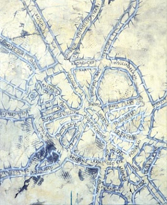
Guillermo Kuitca uses maps as metaphors for human relationships, as you an see in the examples of his work I have shown below. He always uses political, psychological and social reference in his work, no matter how abstract.


Monday 7 May 2012

Photoshop prints

Over the bank holiday weekend I used photoshop to make patterns from the maps I have drawn, and already used by photocopying. I thought I was a good idea as it is easier and faster (technically) to experiment with colour and pattern, including repeat pattern and placement.


I can't decide if I like these prints. I think some would look better on very thin material, perhaps for use for a scarf design. However, I prefer my photocopied and hand-drawn designs, I feel they are more organic, and the motifs are stronger on them.