Tuesday, 22 May 2012

FutureEverything at MOSI

I visited the Museum of Science and Industry and came across the current exhibition in the 1830 warehouse, FutureEverything. It brings together artists working with sculpture, video and digital work.
A lot of the work in the exhibition focuses around social media. One of the first pieces I saw within the museum, leading us to the exhibition was "Extra! Extra!" by Jeremy Hutchinson and was a series of newspaper advertising boards, featuring ordinary, everyday quotes from Facebook, which users were invited to write on the event's "wall" on Facebook.
Once inside the exhibition, the same newspaper adverts can be seen in a large pile in a corner, which I felt was perhaps an effort to take away the digital use of Facebook, and show what all of the quotes look like physically.

My favourite piece in the exhibition was "JSUT CODE" by Helen Pritchard and Winnie Soon. It was very coincidental that earlier in the day, as the "Wearingit" group, we had spoke about having QR-codes for each of the group blogs. The idea that anybody can scan in the QR-code and see a website or a quote is quite inspiring.

 
"JSUT CODE" uses social media site Twitter to invite and collect people to write whatever they want. The idea is that the database of digital and social media moves beyond and between languages. As a viewer, one can take part in translating the many codes to find a series of anonymous quotes. This is an example of a de-coded tweet:

Wednesday, 16 May 2012

Our Final Film

This is our final film exhibiting our final piece.
We collaborated with Tom Valentine, an Interactive Arts student who is also doing the Unit X project.
I'm very happy with the film as I feel it doesn't overwhelm the viewer with lots of miss-matched photos, or too many ideas and unnatural effects, however portrays our idea about the spreading of germs and disease throughout Manchester during the Industrial Revolution, resulting in a destructive outcome. I think the video works as its quite haunting, especially with the movement of the shadows in the background. 


Stop-Motion Film


This is the stop-motion film I had prepared for by creating large-scale maps to apply finger prints to.
I decided on this maps as it has good positioning and shape and uses one of our main colours, red. We applied the finger prints using blue acrylic paint, as blue was another of our main colours we used.

Tuesday, 15 May 2012

Large scale map #4

This is the final map I drew on to fabric. I used more positioning on this sample rather than pattern:

Saturday, 12 May 2012

Working on mannequin #2

I have experimented with my large scale map#2 to see how it would look on the body:


I really like this sample above because I think its a really strong structure, and shows off the maps of old Manchester in a modern way. However, for our final piece I understand it needs to be more old-fashioned style. So I created this one:


I tried to create the old- fashioned style with pleats but made it a little more modern at the back, instead of visible buttons.

Friday, 11 May 2012

Large scale map #3

I think this is the sample that Sonia and I will use to create a stop-motion film of footsteps on to the map:

Large scale map #2

I have carried on my idea of creating large hangings of fabric with maps hand-drawn on to them, using placement and colour carefully. To possibly use in the final piece. In this sample I used blue fine-liner to colour in the map, in way that could show population of people.. Or germs... Spread slowly:

Thursday, 10 May 2012

Kathy Prendergast

Another artist who uses maps in their work, is Kathy Prendergast.
These maps below, on first glance without knowing any background details about them are similar to my work.


After a little more background research, I found Prendergast's 'Lost Maps' work (below), which looks like an ordinary map of the United States, however on closer inspection, it reveals that all the names of places have been removed from the map except for those that begin and end with the word lost (e.g., Lost Creek, Lost Island, and Lost Canyon):


Although I am happy with the work I am doing with my maps, and am including concepts behind them, work such as Prendergast's makes me want to work with maps again and try out more ideas. 

Wednesday, 9 May 2012

Working on to a mannequin

Following my work with prints via photocopying and hand-drawings, I thought it would be good to see how the pieces looked on a mannequin, as improvised garments, or parts of garments, to possibly use in our final piece. 


I enjoyed doing this task, it's good to see how this piece looks a a dress, gathered, pleated and draped. As a group we have often talked about perhaps using draping fabrics as background, or parts of a garment, so I did a piece to portray a sleeve draping down:


I am happy with this piece even more so now, and look forward to carrying out more, similar samples.

Progression of large-scale map

After creating my large-scale hand-drawn map, I decided to add colour with embroidery to show the idea of a journey through the map. Perhaps the speeding of germs through Manchester. I used the colour red because it links in with the other people in my group's working too, as we have decided red and blue are our main colours.


I am really happy with this sample, and will use a mannequin to model it as different parts of a garment. I also hope to make more large-scale samples like this, maybe with different patterns and other uses of colour. 

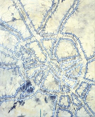
Guillermo Kuitca

I have decided to look at other artists who use maps in their work.
Guillermo Kuitca uses maps as metaphors for human relationships, as you an see in the examples of his work I have shown below. He always uses political, psychological and social reference in his work, no matter how abstract.


Monday, 7 May 2012

Photoshop prints

Over the bank holiday weekend I used photoshop to make patterns from the maps I have drawn, and already used by photocopying. I thought I was a good idea as it is easier and faster (technically) to experiment with colour and pattern, including repeat pattern and placement.


I can't decide if I like these prints. I think some would look better on very thin material, perhaps for use for a scarf design. However, I prefer my photocopied and hand-drawn designs, I feel they are more organic, and the motifs are stronger on them.

Friday, 4 May 2012

Curriculum Vitae

Lois Gowland
Lois_Gowland@hotmail.com | loisgowland.blogspot.co.uk


EDUCATION:
Manchester Metropolitan University                                                             September 2011- June 2014
BA(Hons) Textiles In Practice

Newcastle College                                                                                                 August 2010- May 2011
Foundation Diploma in Art and Design
  • Grade: Pass


Heaton Manor School and Post-16                                                                 September 2003-June 2010
A-Levels: English Literature (C), English Language (C), Textiles (C), Geography (D a AS)
GSCE: 2 As, 4 Bs, 4 Cs

WORK EXPERIENCE:
Hilton Hotels & Resorts                                                                                            October 2009-Present
Conferencing & Events (C&E) Banqueting Team Leader
  • Responsible of teams of up to 6 people ensuring efficient and correct service of customers during busy events of up to 500 people.
  • Often required to work with the bar team.
  • Have developed time-keeping, communication, problem-solving and leadership skills during my time here.


Oxfam GB                                                                                                                  June 2008- June 2010
Shop Volunteer
  • Responsibilities including creating shop window displays, shelving and wall displays.
  • Sorting of clothes and items to sell, or to donate to WasteSaver.
  • Managed the stock of the New Products Range.
  • Trusted to work without supervision on many shifts.
  • Helped with Oxfam’s Re-Make/Re-Model project for Newcastle’s Green Festival in June 2010, creating garments out of old clothes as well as modeling for the event.


SKILLS:
IT/CAD Skills: I have experience with using Photoshop in many projects, to create prints and present my work. I enjoy doing so and will continue to develop these skills.
Pattern-Cutting and Fashion: Since GCSE my Textiles work has always been Fashion-based. During my time at Heaton Manor we were taught how to use existing patterns, as well as how to customise and create bespoke pieces. I feel this is a good skill to have and use it when an opportunity arises.
Knitting: I am enjoying developing my hand and machine knitting, I would like to be able to create knitted garments soon.
Drawing and Painting: I use various techniques and materials to draw with, to give depth to my sketchbooks and larger pieces. Recently I have started to enjoy painting with Gouache paints, which help me to add colour to my work. With a lot of my drawings, I take them to Photoshop and work with them digitally.
Presentation: I believe two strengths of mine are visual and verbal presentations, which I have developed since A-Level.

Tuesday, 1 May 2012

Pattern-making with Maps: Progression with colour and repeats

Following a productive printing session, I used the facilities on campus to photocopy four of the prints that were a reasonable size, on to tracing paper. Because I don't think I have the facilities to apply my prints to fabric, I hope I can create some interesting ideas using tracing paper, here are the designs as more repeat patterns:


On the outline maps (last two) I experimented with colour, although it took a long time. I will photocopy them in colour and proceed to work with these on a mannequin and photoshop.