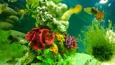
Wednesday, 11 December 2013

Practice Unit: Week 9

This week was our PE review presentations. This really helped me to focus my project in terms of concept and context, since I was presenting my idea to people who were hearing it for the first time. I received some good feedback from this, from tutors and students who seemed interested by my presentation of my concept and my future intentions of designing for Children's wear. I used the contextual reference of Molo Kids wear to underpin my future intentions. 

They are a Kids wear company who have a philosophy that children should express their creativity through their clothing, and that children's wear should be as personal as the clothes adults wear to them.  I love that they have this philosophy and create not only great designs for everyday wear for both genders, but also create a personal connection with the consumer through their concept.

Molo Kid's online catalogue and look book. 

I described Molo Kid's as a company I can imagine myself working for in the future, because of my interest in this market and their brand concept. 

After the presentation and the feedback from my peers and tutors about my work, I feel really optimistic about this project, and am really glad I'm doing this compared to the original project I had began this unit with. I feel it really suits me and allows me to explore my skills really well. 

Practice Unit: Week 8

This week I was focusing a lot on out CP3 draft deadline and the PE review presentation. However, I'd like to include some information on video making. 
I'd like to brand this project, complete with name, neck tags, swing tags, packaging, live website/blog/online presence. I have already written about GIF making, but as my research and concept develops I have made another short video on iMovie on my Mac, to show in my presentation that I am interested in marketing campaigns and branding tools. 


Practice Unit Week 7:

I signed up for a tutorial with Alex Russell, because I felt he would be helpful with advice on my early digital print designs. It was mentioned that my designs so far were a little too "neat" and that I needed something additional to the motifs and drawings work I already had. 

My inspiration from Mary Poppins also includes the song, "A spoonful of sugar" song as well as the candy striped suits. Alex gave me the idea of perhaps sourcing colours from sweets, and also looking in old fashioned sweet shops to widen my scope for visual and conceptual research. 

I took this advice, and below and a few of the photographs I took in Mr Simms Old Sweet Shoppe in Manchester city centre as well as the sweet stands at the Manchester Christmas Markets. I asked to go behind the counter to get better photos:


I played around with the photos on Instagram, in an effort to start thinking about branding and online networking:
 Sherbet 

Mint Humbug


 I would like to use some of these photos in my designs, as perhaps backgrounds or motifs, so i can explore more the combination of real-life and cartoon. I am very pleased with how I feel about the project as it stands, especially after engaging in more visual research which has given me another boost.

Thursday, 21 November 2013

Practice Unit: Week 6

This week I have done mainly digital work, using Photoshop and Illustrator, after some more drawing and mark making.

Below, I have drawn the pattern on a carousel horse's body:


It's a decorative, elaborate pattern which is very common amongst carousels and fairgrounds, which I feel I need to be focusing on more, to give an over all "cluttered" and realistic carousel design.
I took this drawing to photoshop to play with, and came up with a couple of (very early) prints:


I like how they have turned out aesthetically and they are quite interesting and quite literal, however I think they need a lot more work, especially with colour, which is why I went back to my original inspiration and designed some candy strip designs:


I got the colours from scenes of Mary Poppins, in which Dick Van Dyke wears a candy stripe suit, and other photographs I have from carousels.
In the tutorial last week, I was inspired by a peer to create GIF images. I think they are a great branding tool, for use on a website and online, so I found an online tutorial and learnt how to create a GIF image:
You can see the image in all it's glory here:
It's not a GIF I would use professionally, however it was a great learning experience- very quick and simple to do. On the topic of branding, I understand I will soon have to do some work on this. 

My context and outcome for this project is a branded luxury fashion company proposal for girl's aged 2-12. A capsule collection for S/S 2014 plus a high street collection, affordable alternative for stores such as Debenhams or Next (e.g Baker, Ted Baker at Debenhams). Branding proposal to include: Name, logo, website design, swing tags, neck tags, packaging, networking and feedback. 

New learning agreement + Baker by Ted Baker childrens wear examples.

Friday, 15 November 2013

Practice Unit: Week 6

I felt refreshed after the tutorial last week and had some positive feedback from the group. I have carried on with collecting and creating visual research, working with different techniques and media to respond to my primary and secondary imagery:


I was a little worried that using various techniques and media will create took wide an angle on my prints- that I don't have a "signature" way of working. However, this imagery will be narrowed down when I get to the main visual stage and the collection and brand will make more sense. As well as forms of horses, I have also been mark making and working digitally to respond to the movement of the carousels:


These pieces above showing forms of the horses moving have kept my inspiration for the theme of creating prints showing carousels coming to life strong. 

In terms of context, I am still currently working towards a children's fashion outcome, for girls aged 0-10 (for now I'd like to keep my options open).
Dolce&Gabbana 
http://www.dolcegabbana.com/dg/child/

Monnalisa Floral Tulle Dress. Embroidered.
http://www.childrensalon.com/girls-floral-tulle-dress.html

Anthropologie & Kico Kids Head band.
http://www.pinterest.com/vicvickyvic/baby-children-goodies/

What I have picked up from all of these very different garments and prints, is the power of placement. At my current project stage I can only think about placement of motifs and prints however, it is the part of designing for children's wear that I enjoy the most- Which brings me to the last point of the week. We were informed this week of a live project headed by Nigel Hurlstone which involves an exhibition in Paris. Terms of which are that the work includes some sort of embroidery or appliqué. I have been planning on working in to my prints already with possibility of using the laser cutter at some stage. A limitation I have found with some of the live projects has been the briefs which don't relate to my work, but this live project sounds right for my current work. 

Thursday, 7 November 2013

Practice Unit: Week 5

After the tutorial last week where it was decided by the group that I should rethink my project and what I want out of it, I have felt a bit of a weight off my shoulders. On reflection I had backed myself in to a corner with the Fish Therapy project and although I could visualise it in my head as a concept and possible brand, when it came to actual visual imagery I was lost. 

With this in mind, I am going back to what I know and really enjoyed doing last year which is working towards a childrenswear context. I found inspiration in a fairground theme looking at movement and in particular the Carousels, which for most people provide a sense of nostalgia (like me whilst visiting NYC earlier this year):

"Jane's Carousel" DUMBO, NY 


Whilst happy with this inspiration, I am aware I need a strong concept. Over this weekend I watched Mary Poppins (for research purposes...) and was happy to see this scene again:


I always loved this scene when I was younger, especially the style of Disney's work- combining real-life and cartoon. Although interestingly, the 'real-life' carousel horse is much less life-like than the cartoon horse! In addition to this contrast, I also rekindled my love other themes in the film:

The boys' candy-stripe suits give a nostalgic, vintage colour palette

"We love to laugh
Loud, and long and clear
We love to laugh 
So everybody can hear"

This famous scene introduces Uncle Albert who, the more he laughs, the more he floats up in the air. Laughter is of course contagious, so by the end of the scene the whole group is up in the air laughing and have a tea party- Uncle Albert resembles the "Mad-Hatter" from Alice in Wonderland in this scene.

I conducted some of drawings from my own images of carousels, as well as found images online, shown here on the moodboard I created for the group tutorial:

With these themes and my visual research in mind, I feel my concept is going very much in to surreal, possibly quite fragmented images of carousels with a vintage theme. 

Thursday, 31 October 2013

Fish Therapy: Week 4 After Tutorial thoughts

I hate my project and want to quit uni and not grow up and think about anything ever again. 


Taking a break from "Fish Therapy". . .

Wednesday, 30 October 2013

Fish Therapy: Week 4

Context:
Over the past week, I have been working towards a different context. The idea of an installation for Alzheimer's patients didn't inspire me enough, and I found it difficult to imagine it in context. In my tutorial last week (24/10/13) with Mark Beecroft, we discussed the idea of designing material for smaller, more everyday items for around the household. For example, coasters, tea towels, mugs, blankets as well as canvas wall art. I have also been reading a book "Designing for Alzheimer's Disease" in which it gives advice on pattern design in domestic environments for Alzheimer's sufferers, including research in to how they generally reaction to types of patterns. I feel smaller settings for my prints would work best as both stimulating materials and a brand, because of the way (from what i have experienced and researched) household objects that catch the eye of the patient will produce a more relaxed, less forced reaction, rather than if you were to make them look at, or touch an installation, or interactive wall piece. 
I am going to look in to using embroidery machines to re-create my digital drawings of the fish. I also want to use the laser cutter to provide layers and depth to my designs. 

Practical:
With this in mind, I have been carrying on knitting to build a portfolio of samples to use digitally in prints:


Another idea of context I have, inspired by the market research I have carried out in to what 'toys' are available for patients, is to create 'feelers', knitted and material hand held objects which provide tactile stimulation. Something for the patient to hold and exercise their hands whilst sitting down, watching tv or having a conversation with a care giver or family member. 

Mark introduced me to a project similar to what I have been doing myself, but on a much larger scale!:
The Hyperbolic Crochet Coral Reef Project:


I think this is a great piece of community work, and impressive! The use of colour is inspiring for me, as it is full of so many different colours, which go so well with each other as they're all bright, and weirdly, natural colours!

This week I also worked digitally, on Adobe Photoshop and Illustrator. I found it difficult to sit down and start this, so just began experimenting, creating motifs and scenes, using my visual research and knitting samples:

(above) I thought this motif worked really well as my samples have been both fluid, and heavily structured


  (above) I really experimented trying to use my own digital drawings as well as my own photographs here, trying to create prints which abide by the research I have found. Designers are discouraged from using geometric designs as it can make the patients unnerved and confused. I want my designs to have depth, to catch the eye but also provide something to concentrate on.


Monday, 28 October 2013

Fish Therapy: Week 3

My tutorial with Julie at the end of last week (17/10/13) involved a discussion of what I am aiming to create for this project, Julie had suggested an installation, something on a wall, or in a space in the room for patients and their caregivers to look at, feel and discuss. At the time I thought this sounded like a great idea- as it really involves the use of senses that I want to respond to, however having never designed/created an installation before, I'm not sure where to start.

Last week I was working on a digital sketchbook on Illustrator, so it was very flat work. This week I decided to start working with materials- to inspire my installation design. I have always enjoyed hand knitting, and so responded to my visual research with knit:


I enjoyed working with knit again, and felt really inspired using different techniques and needles to create these samples. It also made me begin to think about colour. My next tutorial is an option tutorial with Mark Beecroft- I chose to see him because of his use and knowledge of materials, and I hope he will give me a bit of a different approach to the project to think about. I created a new moodboard for this tutorial to show my project up to date- which also helps me present my project to a group tutorial:


Monday, 21 October 2013

Fish Therapy (working title) project: Week 2

This week we had our first CP3 tutorials, so a lot of my week was spent doing research for that, however it has been a bit of a learning curve to manage my time a little better than I have done this week. 
In terms of this project, I have began some visual research focusing on movement. I spent the whole day on Wednesday refreshing my Illustrator skills (one of the reasons I need to manage time better is because everything takes so long!). 
I have experimented with different Illustrator techniques to create a moving effect in my digital sketchbook.
I have tried to approach images in different ways, also looking at forms of the fish as they move.
I would like to use digital print to convey the movement and pattern of the tropical fish life, and then work over it using materials to add texture to the design.

I found a textiles artist, Rachel Gornall who explores colour, light and patterns in her work which has been commissioned for hospitals:


Gornall's work has reminded me that my designs don't have to be literal, and that I should be experimental with materials and techniques (I am interested in doing some laser cutting to aid my designs).
A quote about Gornall's portfolio on her website:
"Light is very important to the work, often informing an inspiration or starting point and always influencing the viewing of the work, creating shadows and interaction between the layers"