Showing posts with label Digital Image Making. Show all posts

Thursday, 21 November 2013

Practice Unit: Week 6

This week I have done mainly digital work, using Photoshop and Illustrator, after some more drawing and mark making.

Below, I have drawn the pattern on a carousel horse's body:


It's a decorative, elaborate pattern which is very common amongst carousels and fairgrounds, which I feel I need to be focusing on more, to give an over all "cluttered" and realistic carousel design.
I took this drawing to photoshop to play with, and came up with a couple of (very early) prints:


I like how they have turned out aesthetically and they are quite interesting and quite literal, however I think they need a lot more work, especially with colour, which is why I went back to my original inspiration and designed some candy strip designs:


I got the colours from scenes of Mary Poppins, in which Dick Van Dyke wears a candy stripe suit, and other photographs I have from carousels.
In the tutorial last week, I was inspired by a peer to create GIF images. I think they are a great branding tool, for use on a website and online, so I found an online tutorial and learnt how to create a GIF image:
You can see the image in all it's glory here:
It's not a GIF I would use professionally, however it was a great learning experience- very quick and simple to do. On the topic of branding, I understand I will soon have to do some work on this. 

My context and outcome for this project is a branded luxury fashion company proposal for girl's aged 2-12. A capsule collection for S/S 2014 plus a high street collection, affordable alternative for stores such as Debenhams or Next (e.g Baker, Ted Baker at Debenhams). Branding proposal to include: Name, logo, website design, swing tags, neck tags, packaging, networking and feedback. 

New learning agreement + Baker by Ted Baker childrens wear examples.

Friday, 15 November 2013

Practice Unit: Week 6

I felt refreshed after the tutorial last week and had some positive feedback from the group. I have carried on with collecting and creating visual research, working with different techniques and media to respond to my primary and secondary imagery:


I was a little worried that using various techniques and media will create took wide an angle on my prints- that I don't have a "signature" way of working. However, this imagery will be narrowed down when I get to the main visual stage and the collection and brand will make more sense. As well as forms of horses, I have also been mark making and working digitally to respond to the movement of the carousels:


These pieces above showing forms of the horses moving have kept my inspiration for the theme of creating prints showing carousels coming to life strong. 

In terms of context, I am still currently working towards a children's fashion outcome, for girls aged 0-10 (for now I'd like to keep my options open).
Dolce&Gabbana 
http://www.dolcegabbana.com/dg/child/

Monnalisa Floral Tulle Dress. Embroidered.
http://www.childrensalon.com/girls-floral-tulle-dress.html

Anthropologie & Kico Kids Head band.
http://www.pinterest.com/vicvickyvic/baby-children-goodies/

What I have picked up from all of these very different garments and prints, is the power of placement. At my current project stage I can only think about placement of motifs and prints however, it is the part of designing for children's wear that I enjoy the most- Which brings me to the last point of the week. We were informed this week of a live project headed by Nigel Hurlstone which involves an exhibition in Paris. Terms of which are that the work includes some sort of embroidery or appliqué. I have been planning on working in to my prints already with possibility of using the laser cutter at some stage. A limitation I have found with some of the live projects has been the briefs which don't relate to my work, but this live project sounds right for my current work. 

Wednesday, 30 October 2013

Fish Therapy: Week 4

Context:
Over the past week, I have been working towards a different context. The idea of an installation for Alzheimer's patients didn't inspire me enough, and I found it difficult to imagine it in context. In my tutorial last week (24/10/13) with Mark Beecroft, we discussed the idea of designing material for smaller, more everyday items for around the household. For example, coasters, tea towels, mugs, blankets as well as canvas wall art. I have also been reading a book "Designing for Alzheimer's Disease" in which it gives advice on pattern design in domestic environments for Alzheimer's sufferers, including research in to how they generally reaction to types of patterns. I feel smaller settings for my prints would work best as both stimulating materials and a brand, because of the way (from what i have experienced and researched) household objects that catch the eye of the patient will produce a more relaxed, less forced reaction, rather than if you were to make them look at, or touch an installation, or interactive wall piece. 
I am going to look in to using embroidery machines to re-create my digital drawings of the fish. I also want to use the laser cutter to provide layers and depth to my designs. 

Practical:
With this in mind, I have been carrying on knitting to build a portfolio of samples to use digitally in prints:


Another idea of context I have, inspired by the market research I have carried out in to what 'toys' are available for patients, is to create 'feelers', knitted and material hand held objects which provide tactile stimulation. Something for the patient to hold and exercise their hands whilst sitting down, watching tv or having a conversation with a care giver or family member. 

Mark introduced me to a project similar to what I have been doing myself, but on a much larger scale!:
The Hyperbolic Crochet Coral Reef Project:


I think this is a great piece of community work, and impressive! The use of colour is inspiring for me, as it is full of so many different colours, which go so well with each other as they're all bright, and weirdly, natural colours!

This week I also worked digitally, on Adobe Photoshop and Illustrator. I found it difficult to sit down and start this, so just began experimenting, creating motifs and scenes, using my visual research and knitting samples:

(above) I thought this motif worked really well as my samples have been both fluid, and heavily structured


  (above) I really experimented trying to use my own digital drawings as well as my own photographs here, trying to create prints which abide by the research I have found. Designers are discouraged from using geometric designs as it can make the patients unnerved and confused. I want my designs to have depth, to catch the eye but also provide something to concentrate on.


Thursday, 16 May 2013

Unit X- National Trust Craft Fair- Reflection

Unit X this year has been an interesting experience. Being introduced to other courses such as 3D design and Interactive Arts was a great chance to see what other disciplines produced with the same brief as Textiles in Practice. It was also because of this that I experimented with ceramics- something I am very happy I learnt and intend to take further in to my own practice. The unit as a whole has been different for me from the beginning, as I have focused on Children's wear mostly throughout my 2nd year, so I am glad we were given a particular briefing to work towards and feel I settled in well with it. 

In terms of collaboration, I worked on this project on my own and was happy doing this, however I did engage with others doing this craft fair option both in tutorials and outside of them, giving and receiving feedback. I felt the Interim Crit was the most helpful example of this as we could all see each other's work via boards and presentations. 

The professional lecture series was a staple for my experience on Unit X, not only learning about other people's experiences after university, but also Paul Scott's Ceramics work inspired my whole project! 
(Paul Scott's Cumbrian Blue(s))

(My toile du joug designs on ceramics)

My sketchbook work developed a lot over the course of the project, and I feel this was a strength. Without my drawings I would not have been able to produce my abstract designs. In addition to this, I created my toile prints on photoshop, a practice which I am very familiar with. However had I had more time, I would have liked to create more designs, and perhaps do some work on Illlustrator- which is a skill I have learnt quite basically in my last project but should have taken further with this project. 

At the beginning I was a little lost with what to do with this brief. I gained momentum with only around 5 weeks to go, when I found my key inspiration from toile design. Then by the time I had printed on to ceramics and thought it would be a final design, I wanted to take that further too. Although I'm disappointed I only thought of ceramic ware and picnic ware within the last 3 weeks, I think it is a good sign of a working designer- that I show I can see when and where I should improve my practice. 
My concept board shows my final proposal of a picnic set, which I am happy with but didn't find enough time to explore materials properly. 
As mentioned earlier, I have been focusing on children's wear throughout my second year, however this project has shown me that I can always learn new skills and have been inspired to design some dinner/breakfast ware for children at some point. I also feel it has been a great brief and final outcome to add to my portfolio. 

Maid's Quarters at the National Trust:

-

Unit X- National Trust Craft Fair- Refinements and Conclusions

After a successful and inspiring Interim Crit, I went back to my design work and created more abstract motifs from the one I presented in the crit, as I felt I could create less obvious Toiles with my drawings.


Whilst design these prints I took into account  composition, back ground space, size of motifs, and thought about how they could be applied to ceramics. I felt some were more successful than others, however as abstract toiles they work well. 
Using some of these designs and my sketchbook drawings, I developed ceramics prints a little more:

I took inspiration from IKEA's Promenad range, which I found when I was buying my ceramics I was drawn to it straight away because of the colour palette which is similar to my own, and also because of the use of composition. Just because they are from a traditional toile practice, doesn't mean I can't use more modern ways of demonstrating my abstract prints on to the ceramics. 

I was really happy with how this breakfast set turned out, and really enjoyed learning a new skill of ceramics transfers.
However, I couldn't help but think I could refine my ideas a little more. I found Anorak picnic ware online, and was inspired by their use of simple motifs and repeat patterns, which create interesting shapes in the background space:


Although my theme and designs are very different, I felt inspired by their designs, as well as inspired to transfer my prints on to picnic ware, this context is even more fitting than kitchen linen and breakfast ware to my site of National Trust Gift Shops as they are a popular picnic destination, it is also fitting for my theme of the Maid's Quarter's, where one prepares the food in the kitchens and it is taken outside to be eaten. Before I began transferring my prints on to picnic ware I wanted to refine my final designs, to create a strong range for a mix and match picnic proposal.
These are the design boards I have created for the final presentation of my work:


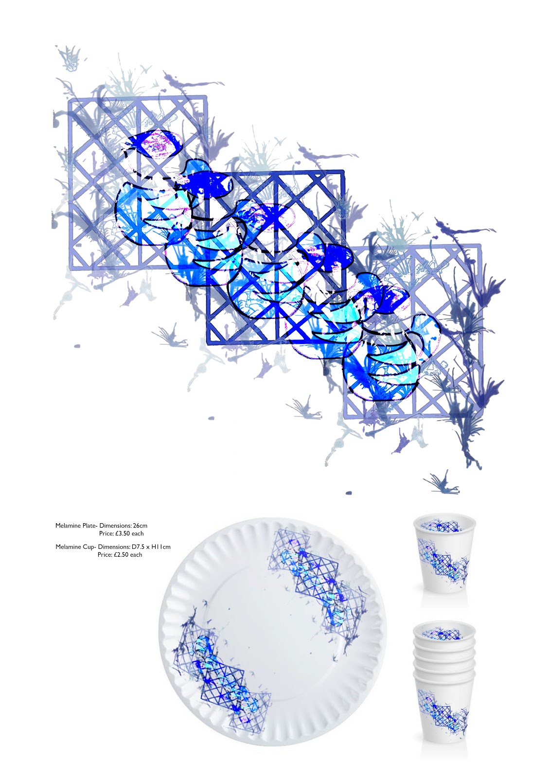
Because of time constraints, I am only able to produce picnic ware proposals, however I feel they works really well as a mix and match set and I am glad I have gone for picnic ware, with the final designs I have created. The picnic set includes: Melamine plates (£3.50); melamine cups (£2.50); platters (£4.50-£6.50); bowls (£3.50) (the prints of which are inspired by my ceramics development); flask (£9.50); picnic rug(£18.50); cotton napkins (£5.50) and a food cover (£7). I decided on the prices after looking at the National Trust gift shops prices, and Habitat and Anorak's picnic ware because their picnic items are made of the same materials I would be using for mine, as well as being the same dimensions.
I refined by boards from the interim crit, because my work has come a really long way in just two weeks. My boards below were presented to around 10 students, 4 tutors and Ann Marie from the National Trust who we have had contact with throughout the project. I feel my presentation went well, as I said everything I needed to say, however it was a little nerve racking! 


I didn't change my Inspiration board as my research hasn't changed. However I did change the Context board, keeping my initial inspiration for the whole project, Paul Scott, and adding inspiration I found in IKEA for ceramic development and Anorak Picnic ware. The new Concept board features my picnic ware as a scene, to show what it all looks like together, as well as my 4 final designs.
I ended up enjoying this project once I knew what I was doing- and I would love to develop this picnic set as well as my designs further, I feel there is a lot of room for improvement, but I am very pleased with my final proposal nonetheless.

Sunday, 17 February 2013

More focused initial designs:

 These are my more focused designs. I need 8-10 designs for my final collection, however there are 15 here- which I am really happy with in terms of colour palette, composition and range of garments. I have narrowed down my main colour palette to 12 colours. I am going to take them in to my last tutorial to get advice on which ones to use for the final collection- I am hoping to include: 3 hoodies, 4 t-shirts and 3 shorts.